Here's an example of an image without shadow:
Here's what we want to accomplish. A smooth shadow with feathered outer edges and corners (topRight and bottomLeft).
|
|||
One approach of solving this is to use two layers positioned on top of each other, using a backdrop image like below (this is created in paint program such as Photoshop or Fireworks):
<img src="images/dropShadowSquare.png" width=309 height=159></img>
<div style="position:relative; left: 0px; top: -159px; width:150px;">
<img src="image.jpg" width=300 height=150>
</div>
</div>
Note: 300 and 150 are the dimensions of the image. 9px is the thickness of the shadow. Type everything on one line, otherwise Internet Explorer shows a gap on the top area.
There are three problems with this approach:
- The shadows lacks uniformity. It gets larger or smaller based on the dimensions of the image (especially bad on the right side).
- The dimensions must be specified on the <img> and the <div> tags.
- There's a large gap where the image is supposed to appear because we shifted the image upward.
The last problem is easily solved by 1) setting overflow to hidden and modying the code slightly to use one instead of two <div>s; and 2) using a secondary image that is positioned to overlap the drop shadow.
<img src="images/dropShadowSquare.png" width=309 height=159></img>
<img style="position:relative; left: 0px; top: -159px;" src="image.jpg"
width=300 height=150>
</div>
You see the result below, note that there's no gap between the image and the text below it. Note: type everything on one line, otherwise Internet Explorer shows a small gap on the top area of the image.
Below is the same technique using a different image. Notice the right edge looks better because the width isn't streetched too much. The other two problems are difficult to fix, because the shadow images do not scale well; and we still want to be able to add the shadow without specifying the dimensions of the image. I know it's considered a good practice to always specify the dimensions of an image, but suppose that I'm tired of having to specify the dimensions - and most users now have connection fast enough that the benefit of specifying the dimensions outweigh the nuisances.

A possible solution is combining the style definitions with our old friend html table. This is a place where even in the era of css, having a <table> is still a useful thing because tables have liquidity that allows them to resize based on content.
That was the reason why I chose to use table instead of <div>. With <div>, you need to retrieve the dimensions of the image before you can overlay another DIV with the same dimensions as the image and put it on a lower layer behind the image with a slight offset. But <div> can still work with sharp edged shadows like described here.
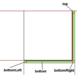
Out first approach is to make a table like below:
IMAGE CELL |
topRight | |
| right | ||
| bottomLeft | bottom | bottomRight |
The shaded cells will contain pieces of the shadow slices that we created in a paint program. The slices are shown below. It is recommended to use png format because png can contain alpha channels. This allows the shadow to blend into the backgrond - whereas using gif, the alpha channel is limited to only full-transparent or full-opaque with nothing in-between.
bottomLeft.png 
bottom.png 
bottomRight: 
right:
topRight: 
We then define the styles for the shadow cells. There are two kind of shadow cells: one for the horizontal shadow and one for the vertical shadow. At minimun, we need to have four styles (you can always hardcode the styles into the table, but for re-usability reasons, minimum here takes into consideration the abilty to use the styles in more than one tables:
- for the cells used as padding (bottomLeft and topRight)
- for the bottom cell
- for the right cell
- for the table
/* you can shorthand some of these styles. I kept them separate for clarity. */
table.shadowTable
{
	margin:0;
	padding:0;
	table-layout:auto;
	border:none;
	border-width:0px;
	border-spacing:0px;
	border-collapse:collapse;
	background: transparent;
}


.bottomLeft
{
	background-image:url('images/bottomLeft.png');
	background-repeat: no-repeat;
	background-position: right top;
	width:9px;
	height:9px
}


.bottom
{
	border:none;
	padding=0;
	background-image:url('images/bottom.png');
	background-repeat: repeat-x;
	background-position: right top;
	height:9px
}


.right
{
	border:none;
	padding=0;
	background-image:url('images/right.png');
	background-repeat: y-repeat;
	background-position: left top;
	width:9px
}


.bottomRight
{
	border:none;
	padding=0;
	background-image:url('images/bottomRight.png');
	background-repeat: no-repeat;
	background-position: left top;
	background-color: transparent;
	width:9px;
	height:9px;
	border-collapse:collapse
}

.topRight
{
	border:none;
	padding=0;
	background-image:url('images/topRight.png');
	background-repeat: no-repeat;
	background-position: left bottom;
	width:9px;
	height:9px;
}
And the <table> looks like this. Notice that cellpadding is set to 0. This is necessary because even though the padding is already set to 0 in the style sheet, without the cellpadding instruction, the table will show one extra pixel. Now this seems complicated but if when using scripts to generate pages, it is a trivial task to replace the <img> tags on the fly:
<tr>
<td rowspan=2 colspan=2><img src="image.jpg"></td>
<td class="topRight"></td>
</tr>
<tr><td class="right"></td>
</tr>
<tr>
<td class="bottomLeft"></td>
<td class="bottom"></td>
<td class="bottomRight"></td>
</tr>
</table>
The result is like this:
|
||
Here's how it looks with current browsers:
There are obvious problems with the bottomLeft and topRight cells due to the fact that that: a) the width of bottom cell is unknown; and b) the height of right cell is unknown. Note: adding width: 100% or height:100% to the style definition does not work. The only way to make this work is to hard code the width onto the bottom cell and the height on the right cell.
You can workaround the bottom cell problem by using a nested <table> like this which forces the table to be the width of the parent table like below (the red outline shows the cells of the nested table):
IMAGE CELL |
topRight | ||
| right | |||
|
bottomRight |
<tr>
<td rowspan="2"><img src="image.jpg"></td>
<td class="topRight"></td>
</tr>
<tr>
<td class="right"></td>
</tr>
<tr>
<td>
<table class="shadowTable" width="100%">
<tr>
<td class="bottomLeft"></td>
<td class="bottom"></td>
</tr>
</table>
</td>
<td class="bottomRight"></td>
</tr>
</table>
The above modification result is like this:
|
|||
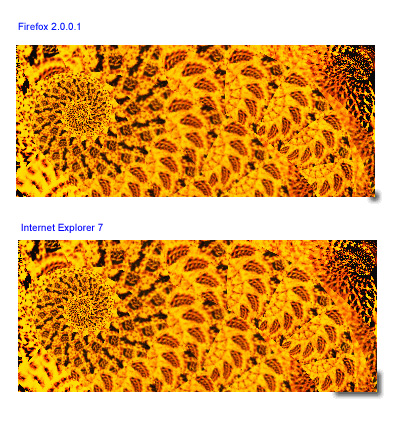
Screenshots:
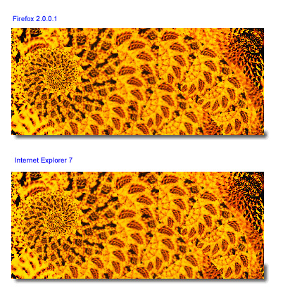
As you see, the method works flawlessly in Firefox, but in Internet Explorer 7 while the bottomEdge problem is solved, the height of the right cell is still wrong. The only way it can be fixed is by hard-coding the actual height (setting repeat to y-repeat in the style-sheet does not work) .
You might be wondering whether using the same technique of adding a nested table will work. In fact I tried that, but it did not work (at least with those two browsers). You can read why in this tutorial.
What works instead is simplfying the table like below, by eliminating completely the topRight cell. That's right, don't you love it when simpler things work unexpectedly?
| IMAGE CELL | topRightAndRight | |
| bottomLeft | bottom | bottomRight |
topRightAndRight aren't split like bottomLeft and bottom. One peculiarity of this method is we need to make a new image slice for the topRightAndRight cell. This image must be as long as the maximum image height you think you would ever use. For me, I made a slice with enourmous height of 1224 pixels, click here to see this image.
Then we need to define a new style for this cell so that the image will be clipped when it's taller than the image. This is done by setting background-repeat to no-repeat. The image will magically clip itself.
{
position:relative;
left:0;
top:0;
border:none;
padding=0;
background-image:url('images/topRightAndRight.png');
background-repeat: no-repeat;
background-position: left top;
background-color: transparent;
width:9px;
}
For testing, here's the new table code:
<tr>
<td><img src="image.jpg"></td>
<td class="topRightAndRight"></td>
</tr>
<tr>
<td>
<table width=100% class="shadowTable">
<tr>
<td class="bottomLeft"></td>
<td class="bottom"></td>
</tr>
</table>
</td>
<td class="bottomRight"></td>
</tr>
</table>
And here are some of the the results:
 |
|||
|
|
Click here for the plain html.
The same shadow on a different image and a different background. Notice how the shadow blends into the background color because the shadow has gradient alpha channel.
 |
|||
|
|
You can use the same technique to add shadows to textboxes. The benefit of this is you do not need to specify the dimension of the box. The box will conform to the line breaks and size itself accordingly.
| This is an example of text inside a box with shadow. Line break here. |
|||
| Line break here. Line break here. More text, more text, more text Line break. More text, more text, more text. |
|||
Want something more fancy? Add outline to the textbox:
.textOfShadowTable
{
  border:1px dotted black;
  position:relative;
  left: 0px;
  top: 0px;
  padding: 10px;
  background: white;
  width:auto;
}
This is a table containing textbox and outline.
And shadow. The width of the box is determined by the amount of text and can be controlled with a fixed size if desired. Otherwise, line breaks and paragraph can be added in the text to force breaks. |
|||
Download the stylesheet: dropShadow2.css
Download Fireworks project containing the shadow slices: box.png.