
ISSUES RELATED TO CHANGING THE CURSOR IMAGE
This discussion is brought about by the new Flash 5 feature: the ability to hide the mouse cursor. Looking at a designer point of view, let's ask this question: Are there reasons why Java 1, Flash 4 and prior version did not include the ability to "hide" the cursor?
I always have the impression that the answer is yes. Clearly the reason is not because this feature could not be implemented (it's not a technical issue); for if it is, then Flash 5 and Director would not have that feature.
So, when Macromedia included this feature in Flash 5, it surprised me, and possibly others. A feature that gives the programmers more control and opens up new creative options is not a bad thing, if used responsibly. However, for what's it's worth, some are left to wonder as to why this particular feature (cursor-hiding) had not come earlier. These are my guesses as to why:
- The usability risk: There are certain preconceptions on the web. One of these preconceptions is the point-and-click nature of the web. Most users comes to rely on the browser-window's cursor; and hiding the cursor "breaks" the rule. So, on a browser environment, hiding the cursor completely (without replacing it with another cursor-icon) might confuse the user because he/she will not know where the cursor is. Most users like to be "in-control;" and a missing cursor could potentially "upset" them. (Maybe "upset" is too strong of a word to use, how about "confuse?")
- The abuse risk: For instance, on the web, a rogue Flash movie can
open a full screen movie (that looks like an error window - the blue screen of death), and hide the cursor. The confused user might think his/her computer has gone berserk. Without hiding the cursor, this kind of behavior is already pretty annoying, the missing cursor can magnify the problem.
Be that as it may, the genie has been put out of the box. So, how about looking at more common issues and their possible solutions?
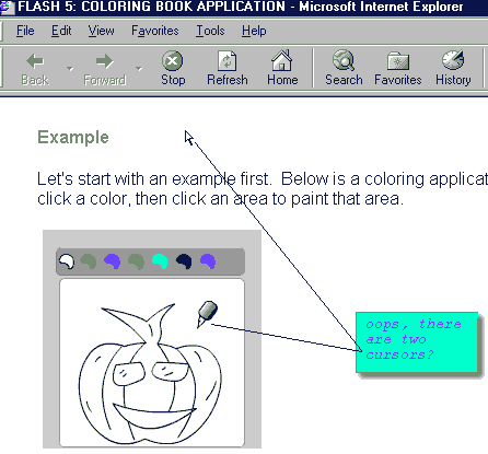
I. THE DOUBLE CURSORS SYNDROME
When a program (for instance a Flash movie, or a Director movie) is run from a browser, and that program changes its cursor appearance, the program often do not know when the cursor has left the movie window. This usually results in two cursors being visible on the screen at the same time. The first cursor is the phantom "inactive" cursor in the Flash movie, and the the other is the browser's cursor. (I have to admit that I'm not immune to this problem.) For example, the picture below shows a familiar "double-cursors" situation:
Since one of the cursor is inactive anyway, most users will not get disoriented; so this is not a big deal in most cases (it just look rather untidy). If you're interested, however, there are several ways to handle this by checking whether the mouse is inside the program or not. If it is not, hide it. This may require JavaScript or other acrobatics to detect mouse-ins/mouse-outs.
This kind of acrobatic is usually a hassle for programmers, and many just ignored it (myself included). There are several possible reasons for this (I'm not saying these are valid):
- The programmer doesn't care.
- It's tricky, one solution won't always work on all browsers.
- It's time consuming, and all that time for what? Many think that the hassle is not worth the time.
- Some programmer will find this task a challenge, but many won't. Reason: the problem on itself is not really a "part" of their program. (Finding out why a certain JavaScript/DHTML code to detect mouse over doesn't work on Macintosh browser brand A but not on Windows browser brand C is not a "challenge," it's nuisance. There're programmers who specialize to program "device drivers," and then there are some who just hate suck tasks.)
In Flash, one thing that would've solved this problem is Macromedia had provided a function that not only show and hide the cursor, but actually change the cursor. Hopefully Flash 6 will.
This might seem surprising:
According to Dr. Deborah J. Mayhew in her book "Principles and Guidelines in Software User Interface Design." (see references): "... the main disadvantage [of mice] ... is that mice requires a certain amount of learned eye-hand coordination and can seem ankward and difficult to use to first-time users. Many ... find this difficult to believe until they watch a representative set of first-time users." (p. 390)
II. THE MISSING HAND ISSUE
This issue occurs when the cursor is moved to a hotspot (button, links), but the cursor does not indicate that the hotspot is clickable. The problem with this is that it "break" the web-browsing convention. For example:
Here's how hotspots normally appears on a html page:
Here's a link.

If the user move the move over the link or the buttons, the cursor changes into a "hand," indicating "clickable" item.Here's how hotspots might appears on a cursor-altering Flash movie:
If the user move the move over the link or the buttons, the cursor does not change into a "hand." (Also note the "double-cursor" problem when you move the cursor in and out of the gray movie area.)The remedy:
- Detect mouse-overs, and change the cursor to indicate hotspot, and/or
- Glow, change the color of the hotspot when the cursor is over that hotspot.
III. THE CASES OF AMBIGUOUS CURSORS
Example of ambiguous "pointer" cursors:
confusing "pointers"These cursors are not ideal for use as "pointers." It isn't very clear where the hotspots of these cursors are (top-left, bottom, right?). They might be okay if there aren't a lot of buttons or clickables that are positioned close to each other, but it's best to avoid them.
Case 1:
ambiguous pointer, with buttons close to each othersCons:
- unconventional/unclear/questionable metaphor (what does a circle represent?)
- it's not obvious where the hotspots are (in the picture above, which button does the cursor in the picture pointing to?)
Possible solution:
- Change to a less ambiguous shape (with clear "tip"); and/or
- Position the hotspots (buttons) far from each other; and/or
- Make it clear when the cursor is over a hotspot (for example: glow the button under the cursor)
Case 2:
better metaphor, except there's no clear "tip"This hand-type cursor (with even-length-fingers) is common and acceptable "during" a drag and drop operation, however as a "pointer," it has the following disadvantages:
Cons:
- again, it's not obvious where the hotspots of the cursor is (which button does the cursor in the picture pointing to?)
Possible solution:
- Make one of the finger longer so it's more obvious where the tip of the cursor is; or
- Make the buttons farther from each other.
- Make it clear when the cursor is over a hotspot (for example: glow the button under the cursor)
make one of the finger longer to emphasize the pointer, highlight the "pointed" areaCase 3:


Are the shapes above suitable to use as pointers to buttons or menu items? Some thoughts to consider:
and it's not likely to point like this:
This pencil shape is a poor metaphor, this kind of cursor is great for special purpose operation, such as drawing, but questionable as a general purpose pointer.
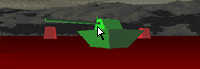
Case 4:
Take an example of an action game below. There are no buttons and no menu item. Basically, the user task is to shoot the tanks. Which cursor is preferable?
Option A:
the cursor is replaced with a "targeting rectangle."
Option B:
the cursor is the regular "pointer" icon.Personally, I think Option A is better, because the targeting rectangle fits the metaphor of the task at hand. Option B is not entirely unacceptable, it just doesn't fit too well.
Case 5:
The case of the magnifying glass cursor.
This kind of cursor is common during a "zoom-in/out" operation (Photoshop, Flash, etc. use it). It can be argued that it is not clear where the tip of the cursor is. (Is it the glass or the end of the handle?)
Does it mean that this is a bad cursor? Not necessarily, for the following reasons. First, the appearance of the cursor on itself is a good metaphor for the task at hand (to zoom). Second, the cursor does not act as a "pointer" per se, because it is not necessary to be very precise during this kind of operation (clicking anywhere close to the area to be zoomed-in will bring the desired result). Now, if this kind of cursor is used to "point" to a button or hotspots, then it will not be so suitable.

SUMMARY
This discussion is not about persuading the reader into not using the "change/hide" cursor feature. This is about presenting the problem, issues, and suggest solutions (when possible). Because being able to change/hide the cursor is a double-edged sword, the potential to enhance or to hamper the user's experience is there.
REFERENCES
Here they're:
- Jakob Nielsen's Alerbox colums has some interesting articles. I don't always agree, but he offers interesting read.
- Mayhew, Deborah J. "Principles and Guidelines in Software User Interface Design." Prentice Hall. Englewood Cliffs, NJ. 1992